The NIH's "Rule of 21" — Part 1
Caution: This case study is quite technical relative to the others on the website. In Part 1 we address misleading aspects of log-log graphs, and in Part 2 we discuss issues surrounding optimization. Readers with neither an interest in the NIH's Rule of 21 nor a basic background in log-log plots and optimization theory may instead wish to read our other case studies.
tl;dr summary: The NIH had planned to limit the number of their grants that any one scientist may hold concurrently. Their stated rationale is that there are decreasing marginal returns from additional investment in a single research lab. They have supported this claim with a series of data visualizations plotted on a log-log scale. But curves that exhibit decreasing returns on a log-log scale may exhibit increasing returns when plotted on a linear scale. Therefore the graphs that the NIH has presented fail to demonstrate the decreasing returns to scale they are purported to show.
Background
In May 2017, Francis Collins, Director of the US National Institutes of Health (NIH), announced a new set of regulations around how NIH funding would be awarded. While the NIH had not previously limited the number of grants that a single principal investigator could hold, Collins described a plan to cap the concurrent NIH grant support held by any one investigator to 21 "research commitment index" (RCI) points. In this system, 21 points corresponds to three R01 grants, i.e., three major research grants.
This new rule, dubbed the Rule of 21, appeared to be motivated by a desire to spread the NIH funding more broadly among numerous investigators instead of concentrating it among a small elite. To justify doing so, the NIH argued that there are decreasing returns on investment in a single investigator, as her time is split among more and more projects. After extensive outcry from researchers, the Rule of 21 plan was scuttled on Jun 8th, 2017.
We are not interested in taking a position about whether or not this would have been a desirable plan. Rather we want to look at the data-driven arguments that the NIH used to support the plan. The NIH doubtless will continue efforts to estimate researchers' productivities, and it is critical that these be grounded in valid mathematical analysis. At present, they are not. In short, our position is that the arguments the NIH presented to researchers and to congress in support of the Rule of 21 are utter nonsense. In this case study, we examine a few of the problems with these claims1 . In particular:
- The data visualizations used to support this plan are misleading because are based on the concavity of curves on log-log scale, but used to make claims about concavity of the curves on a linear scale — and these may not be the same.
- The curve used for optimization is a composite of results from many investigators of differing abilities, not the output of any single investigator. Given that there should be a correlation between an investigator's ability and her funding level, changing the funding allocated to any single investigator will not, even on average, change that investigator's productivity as predicted by the composite curve.
In Part 1 of this case study, we address the first of these issues. This topic has already been raised in varying degrees of detail (and varying degrees of accuracy) in comments on the original blog posts, on social media, and in various articles, but we aim to collect the full story here, to provide a bit more formal rigor, and to offer a cautionary tale about drawing conclusions from data presented on a log-log scale. In Part 2 of the case study, we address the second of these issues.
A misleading tangent line
In early 2017, the NIH Deputy Director for Extramural Research, Mike Lauer, introduced a new metric, known as the Research Commitment Index (RCI), which had been designed to quantify the level of grant support that an investigator receives. In this introductory blog post, Lauer claimed that this metric could be used, in concert with the NIH's internal citation impact metric RCR, to demonstrate that there are decreasing returns from investing more and more in a single principal investigator.
"Figure 5 [reproduced below] shows the association of grant support, as measured by RPG RCI per year, with productivity, as assessed by the weighted Relative Citation Ratio per year. The curve is a spline smoother. Consistent with prior reports, we see strong evidence of diminishing returns."
The solid blue curve shows the general trend line for the 71,493 investigators in the data set. We can think of this as a production function that gives us the expected output (measured as total annual weighted RCR) as a function of the input (measured as RCI). The dashed black line appears to be some sort of tangent to this production function, though it's neither its purpose nor its provenance are explained in the blog post.
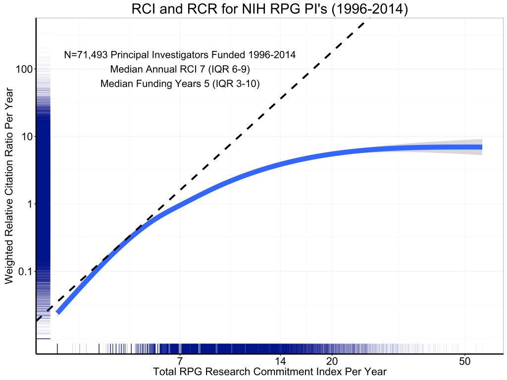
At a quick glance, this data visualization seems to tell a straightforward story. We have a tangent line that appears to indicate the marginal rate of return at some low level of investment (around 4 RCI points or so) and that appears to reveal lower marginal returns at higher level of investment.
The flaw in this interpretation is that this is a log-log plot. On a log-log plot, straight lines correspond not to linear functions of the form \(y=a+b\,x\), but rather to power functions of the form \(y=a\, x^b\). Thus a line with a slope of 1 on a log-log plot corresponds to a linear function. A line with a slope of 2 corresponds to a quadratic power function \(y=a\, x^2\). A line with a slope of 1/2 corresponds to \(y = a \sqrt{x}\).
The dashed "straight line" on the log-log plot shown above has a slope of approximately 4.5. This is concealed somewhat by the very different units on the x and y axes. By counting pixels, we can estimate2 the equation of the dashed line as \(y=2.6 \times 10^{-4} \, x^{4.5}\). This curve is plotted below, and is a far cry from the constant marginal return curve that is suggested by the original graph.
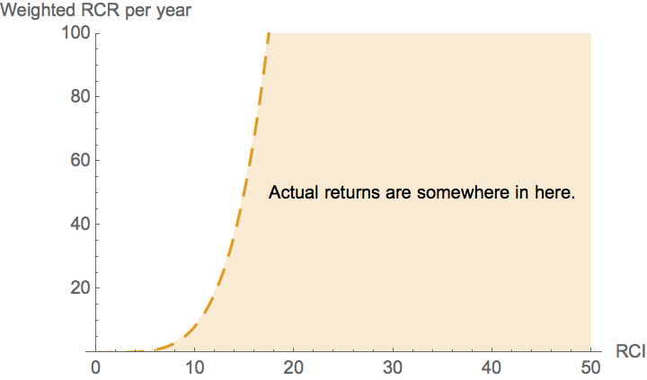
So all we know from the dashed line on the log-log plot is that returns curve lies somewhere below the very steep dashed curve in yellow. In other words, simply from comparing the blue production function with the dashed tangent line in the original figure, we cannot readily discern whether or not additional investment in a given investigator has decreasing returns. All we can tell is that it does not have returns that increase as dramatically as the dashed yellow curve in the figure above. This obviously sets far too high of a bar for justifying additional investment in an investigator.
Evidence of decreasing returns?
In response to criticism along the lines above, the NIH's Mike Lauer released a modified version of the graph.
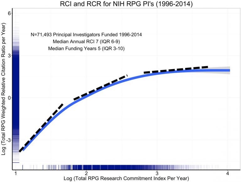
Lauer writes:
[This figure] is the log-log plot; it is the same as the prior blog’s figure 5, except that the axis labels show log values. I’ve added dotted tangent lines that illustrate how the slope decreases at higher values of annual RCI.
Technically, this is correct. The slope on a log-log graph does indeed decrease as higher log RCI values. In other words, the curve is concave on a log-log plot. Lauer's implication seems to be that there are decreasing marginal returns (not just decreasing marginal log returns) on investment into any single investigator on a linear scale.
But concavity on a log-log scale does not guarantee concavity on a linear scale. Consider a twice-differentiable function \( f(x) \) and graph \(y=f(x)\) on a linear scale. The resulting curve will be concave if the second derivative \(f''(x) < 0 \). Now consider the same relationship plotted on the log-log scale. Let \(g\) be the corresponding function on the log-log scale, so that \(\log{y}=g( \log{x} )\) How do the concavities of the functions \(f\) and \(g\) compare?
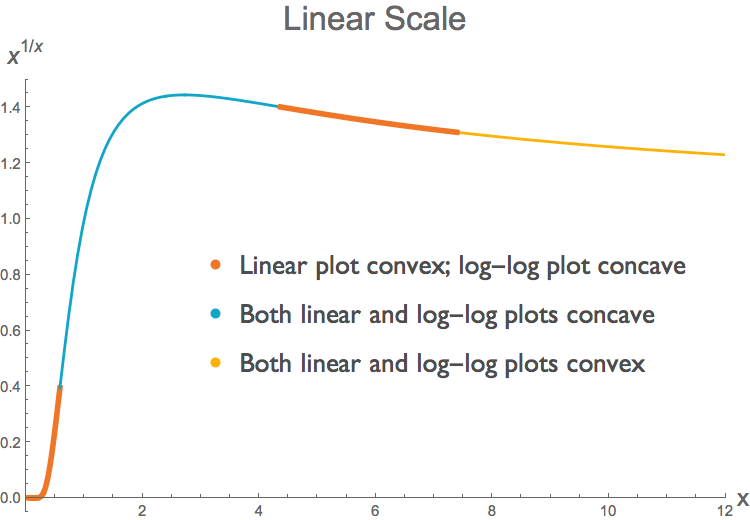
The log transform preserves the sign of the first derivative. But it does not necessarily preserve the sign of the second derivative3. A region of a curve can be convex on a linear scale but concave on a log-log scale. We can readily find examples of such curves. Take the function \( f(x)=x^{1/x} \), for positive x. In some parts of the domain, the curve \(f(x)\) is convex but its log-log counterpart \( g( \log{x}) \) is concave, in other parts both functions are concave, and in yet others both functions are convex. The two figures below illustrate this. Each shows the same curve \(f(x)=x^{1/x}\), but at top we have a linear plot and below a log-log plot. We have determined the concavity of \( f(x) \) and its log transform \(g( \log{x})\) by looking at their second derivatives 4 . (Note that this requires us to look at the second derivative of the log transform, not the log transform of the second derivative.)
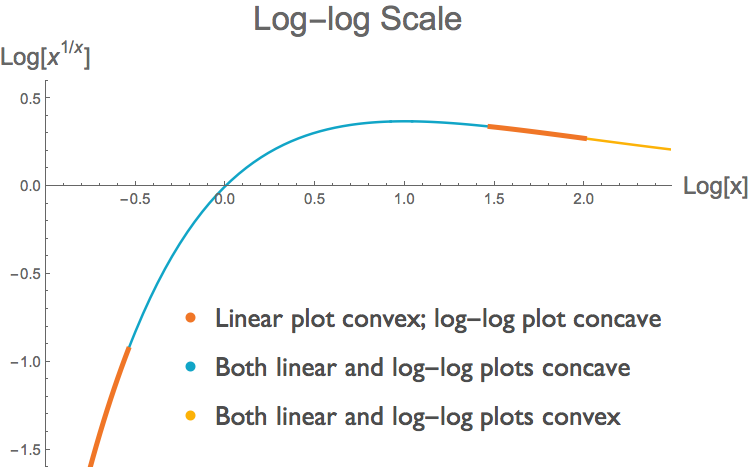
Thus we see that we can not make easy inferences about the concavity of a function from the concavity of its representation as a log-log plot. Lauer defends his choice of a log-log plot by pointing out that the use of log-log scaling is common in similar bibliometric studies. That is true, but that does not mean that log-log plots are appropriate for making claims about convexity. In fact, log-log plots are particularly ill-suited for such purpose, because as we have shown here, the log transformation does not preserve the sign of the second derivative.
It is of course possible that the RCR/RCI data could be concave on a linear scale throughout its domain, and thus exhibit diminishing returns. Our point is simply that the graphical argument in Lauer's revised figure, reproduced above, comes nowhere near establishing that. Indeed, in a figure from Shane Crotty, the data appear to be sigmoidal on a linear scale: convex initially and concave subsequently. (We have not yet verified the validity of Crotty's graph, which plots points inferred from the shape of the original log-log curve).
Marginal productivity of the log.
In support of the NIH's plan, Lauer presents another graphical argument purporting to show diminishing marginal returns, in the form of the following graph:
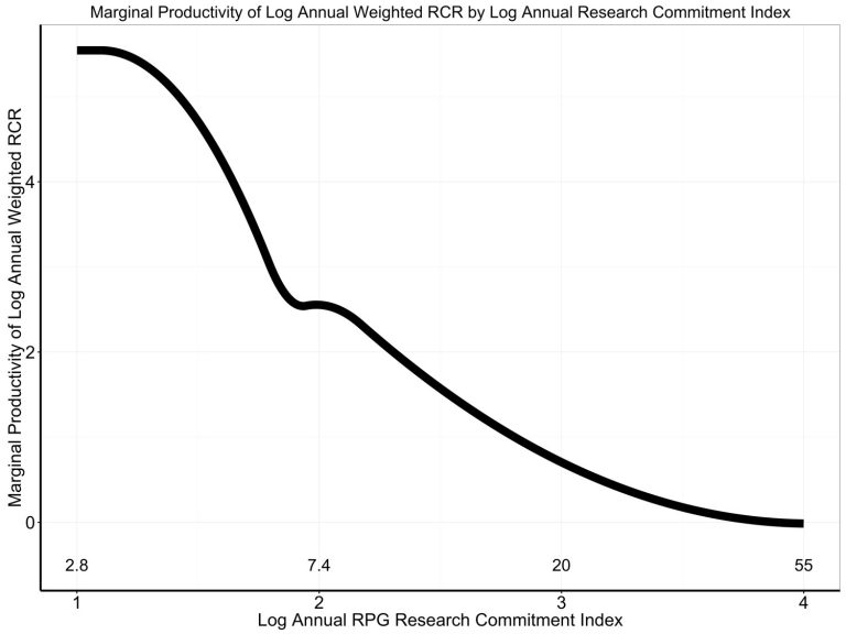
What does this graph represent? Lauer describes it thusly:
Figure 4 shows the first derivative of the association of log annual RCR to log annual RCI with values of log annual RCI. As annual RCI increases, the marginal productivity decreases – this is what is meant by diminishing returns.While this may not seem like an intuitive quantity, it is simply the first derivative of the graph as plotted on a log-log scale. While a negative slope would imply decreasing marginal returns if this were a linear plot, the same does not hold for a log-log plot. This is for the very same reason we have already discussed: the second derivative of a log transformed function need not have the same sign as the second derivative of the non-transformed function. As a result one cannot infer decreasing marginal returns from this plot either.
We can illustrate this with the same function \(f(x)=x^{1/x}\) that we considered in the previous section. Just as the function and its log transform need not have the same concavity, the slopes of the marginal returns of the function and its log transform need not have the same sign. Below, we plot the first derivative \(df/dx\) of the function \(f\), and the first derivative of its log transform \(d \log(f) / d\log(x)\). The latter is the analogue of what Lauer plotted in his figure. We see that across some of the function's domain, the slope of the marginal return of the non-transformed function is positive, whereas the slope of the marginal return of the log-transformed function is negative.
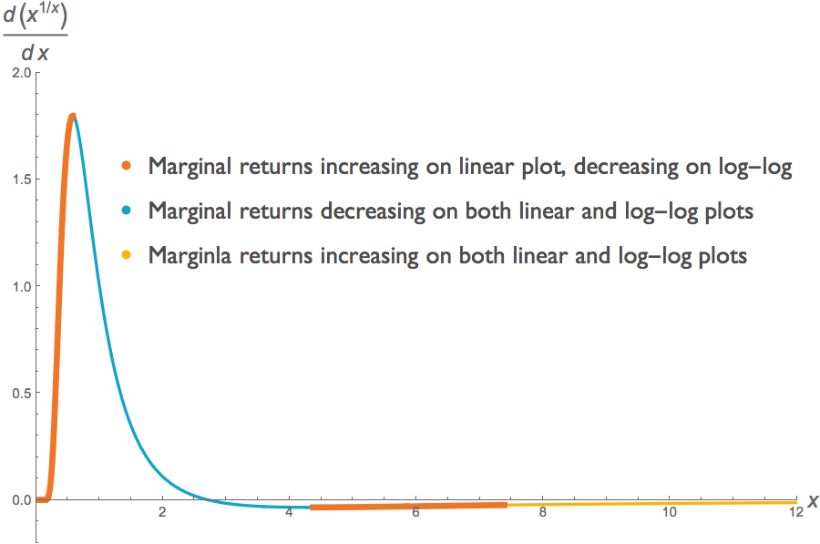
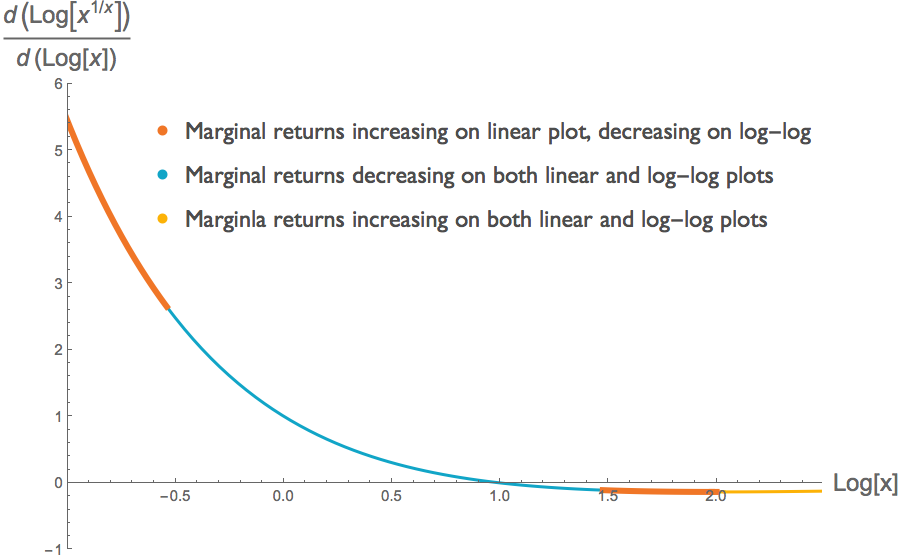
This illustration undercuts the third graph that Lauer presents in an effort to demonstrate decreasing marginal returns. There may indeed be decreasing marginal returns at some point along the graph, but we cannot discern that from any of the information provided in the three figures we have considered here.
Conclusion
In Part 1 of this case study we've looked at the ways in which log-log plots provide a deeply misleading impression of what is happening to marginal return on investment. In Part 2 of this case study we consider the a serious logical problem with the optimization exercise itself.
Carl T. Bergstrom
University of Washington
June 12, 2017
Note regarding author's response: As with all scholarly authors whose work appears in one of our case studies, Mike Lauer was offered the opportunity to publish a response here at the end of our article. We have not received a reply.
Endnotes
1 The plan may suffer from other problems as well, but we here constrain ourselves to concerns about the log-log plots and problems with the optimization approach.
2 To compute the equation for this line, we first determine the exponent. On the x axis, log 2 is 205 pixels. On the y axis, log 10 is 138 pixels. Thus on the x axis, log 10 is about 681 pixels. Since the line has slope 610/670 pixels as measured on the graph, its numerical value is \( \frac{(610/138)}{ (670/681)}\approx 4.5\). To estimate the y intercept we note that the x value lies 293 pixels to the left of 7, or 293/610 log-10s to the left. This means the origin is at x=2.6. The y value lies 103 pixels below 0.1, or at about 0.018. To get to x=1, we’d have to go another 0.41 log-10s, or 279 pixels. This would correspond to 254 pixels on the y axis, or 1.84 log-10s, which would leave us at a y value of 0.00026. The equation for a power law is \(y=a\, x ^ b\) where on a log-log plot b is the slope of the line and a is its y-intercept. Here, the power law in question is \(y=2.6 \times 10^{-4}\, x^{4.5}\).
3 Let\(f'(x)\) and \(f''(x)\) be the first and second derivatives of \(f\). The first derivative of the log-transfored function is \[g'( \log{x}) =\frac{x f'\left(x\right)}{f\left(x\right)}.\] Because \(x\) and \(f(x)\) are strictly positive (as they must be in order to take logs), the sign of \(g'( \log{x} )\) will be the same as the sign of \(f'(x)\) whenever \(g( \log{x})\) is defined.
The second derivative of the log-transformed function is \[g''( \log{x}) = \frac{x^2 f''(x)}{f(x)} -\frac{x^2 f'(x)^2}{f(x)^2}+\frac{x f'(x)}{f(x)}. \] We can see from this expression that unlike the first derivatives, the second derivatives \(f''(x)\) and \(g''( \log{x})\) need not have the same sign.
4 We can determine concavity of \( f(x)=x^{1/x} \) and its log-transform \( g( \log{x}) \) by looking at derivatives. The function \(f(x)\) is shown on a linear scale in red below.
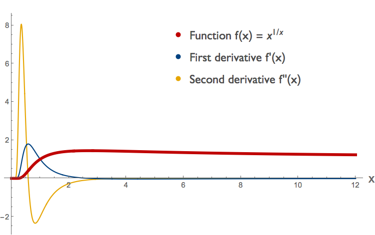
From the sign of the second derivative, shown in yellow, we can see that this function is convex for \(x < \sim 0.58 \), concave for \(\sim 0.58 < x < \sim 4.37 \) and convex again for \( x > \sim 4.37\). (To see what happens around 4.37 we'd have to zoom in; this is not shown here.) We can compare this to the log-transformed curve \( g( \log{x}) \) for the same function, plotted below.
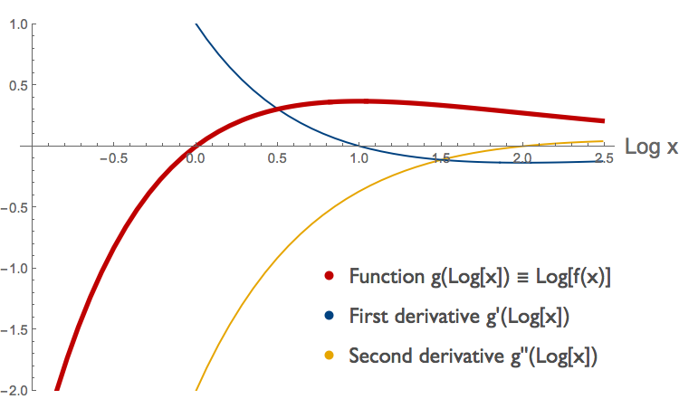
From the sign of the second derivative of \( g( \log{x}) \), again in yellow, we can see that the log transformed function is concave for \( \log{x} < 2 \) and convex for \( \log{x} > 2 \). Notice that this yellow curve is the second derivative of the log-transformed function, not the log-transform of the second derivative.